
Charts: types, data, annotations and controls
Updated 2 months ago
The chart editor in the SlidesAI Platform offers 8 new chart types alongside bar, line, area, pie, and donut, plus a spreadsheet-style data grid with CSV import, six on-chart annotation tools, and per-type controls across four settings tabs. Click any chart on a slide, then click Edit Data to open the editor.
Add or open a chart
Charts are a SlidesAI Platform editor feature; the Google Slides add-on, PowerPoint add-in, and ChatGPT helper are unchanged.
In the bottom toolbar, click Chart to add a chart to the slide.
Click the chart on the slide, then click Edit chart to open the chart editor.
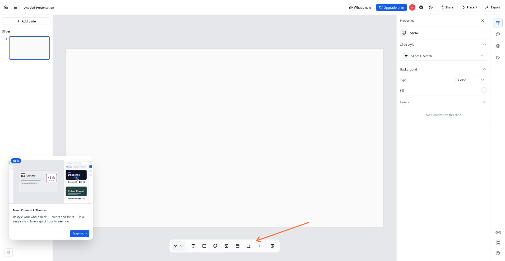
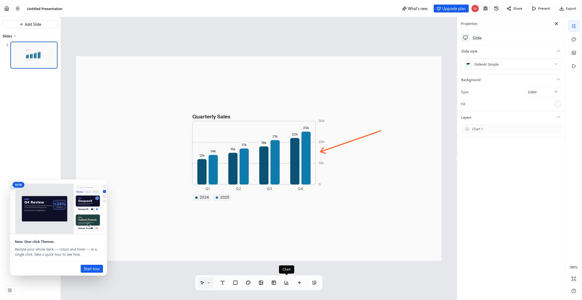
Chart types
AI generation produces all supported charts. If you want to change, every other type is reached from the type gallery in the chart editor: open the editor and pick a new type. Switching types never deletes your data — every type reads the same stored table, and the type only decides which columns are drawn.
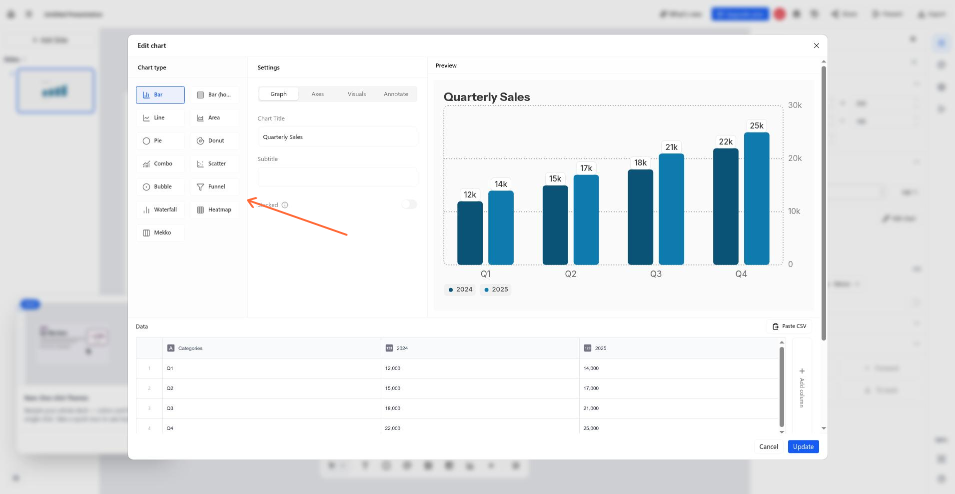
Type | New this release? |
|---|---|
Bar (vertical columns) | No |
Bar (horizontal) | Yes |
Line | No |
Area | No |
Pie | No |
Donut | No |
Combo (bars and line) | Yes |
Scatter | Yes |
Bubble | Yes |
Funnel | Yes |
Waterfall | Yes |
Heatmap | Yes |
Mekko | Yes |
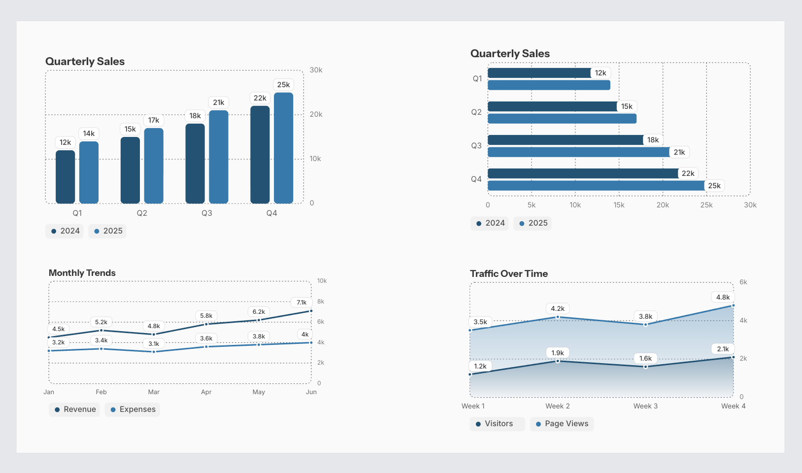
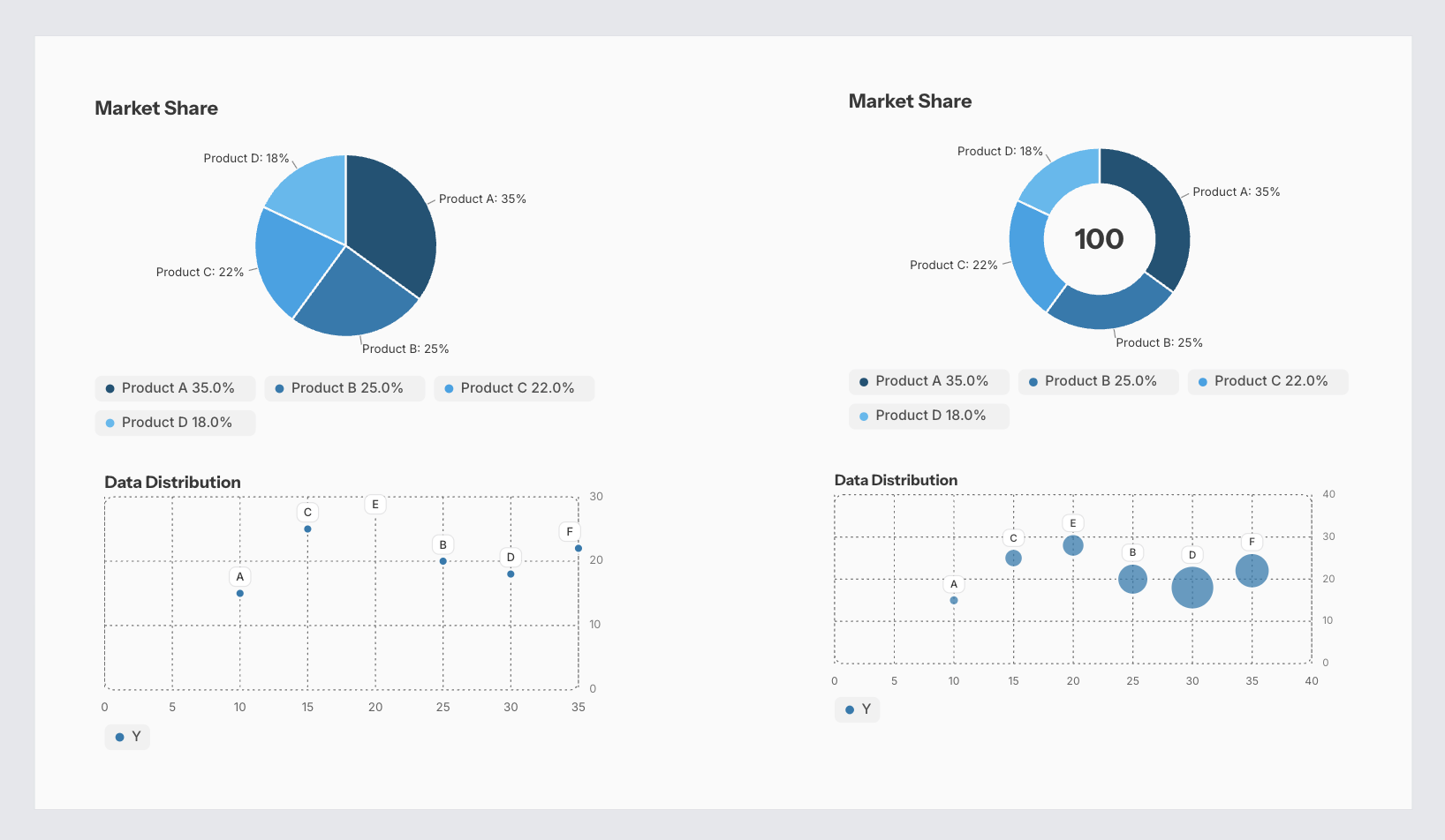
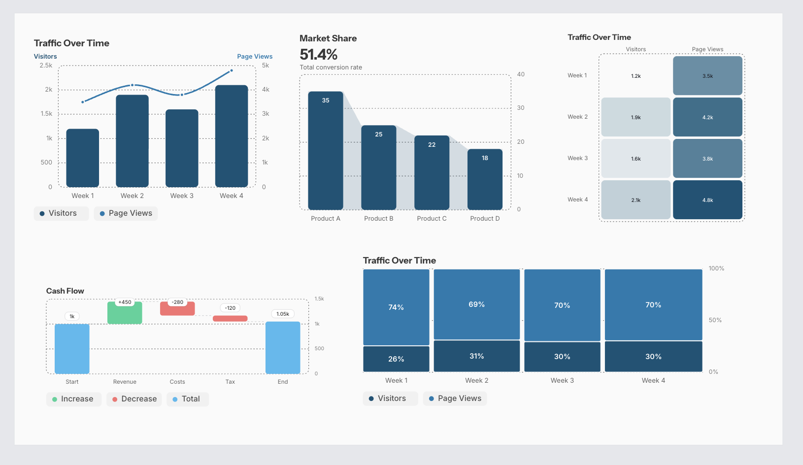
Classic types export to PowerPoint as native editable charts; the new types, and any chart with annotations or reference lines, export as a pixel-faithful image. See Export as a PowerPoint file for the export workflow.
Edit chart data
The chart data grid works like a spreadsheet: the first column holds category names (labelled Label for scatter and bubble), and each series gets its own column with the series color as the header accent.
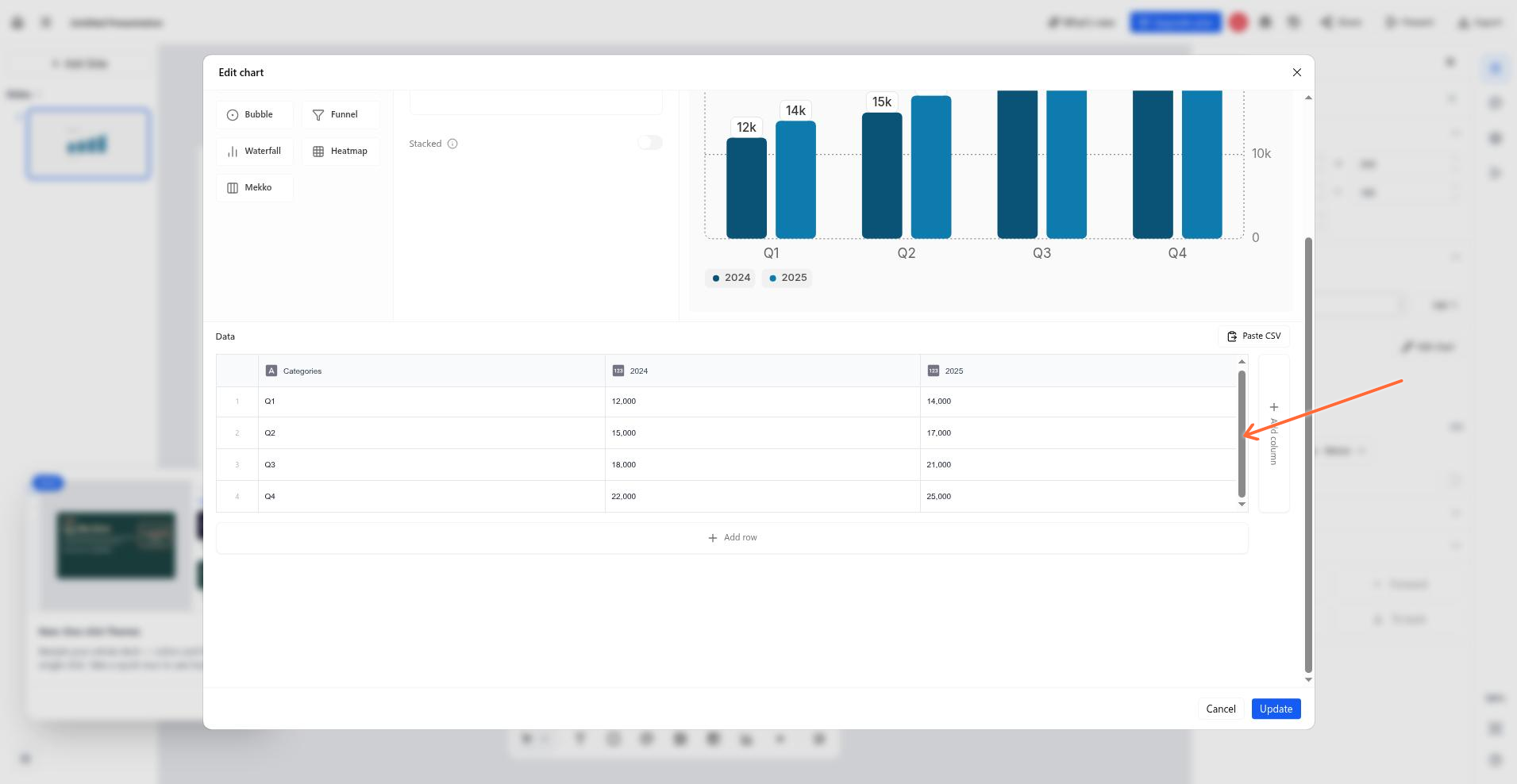
Add row and Add column buttons grow the grid; a chart always keeps at least one row.
The column-header menu renames a series (the field auto-focuses), changes its color, or adds or deletes columns.
Typing into cells is forgiving: commas are stripped, non-numeric characters are dropped, and invalid input becomes 0.
Paste from Excel or Google Sheets at any cell: the grid grows to fit, trailing all-blank rows from the clipboard are dropped, and interior blanks and explicit zeros paste as real rows.
Columns the current type doesn't draw — columns after the first for pie, donut, funnel, and waterfall, and bubble columns beyond X/Y/Size — are greyed in the grid but stay stored and editable, so data survives type switches.
Import numbers from a CSV file
Click Paste CSV and paste the text or upload a .csv or .txt file. The importer is strict: every cell must be unambiguously a number, or the import fails and names the exact column and row of the problem.
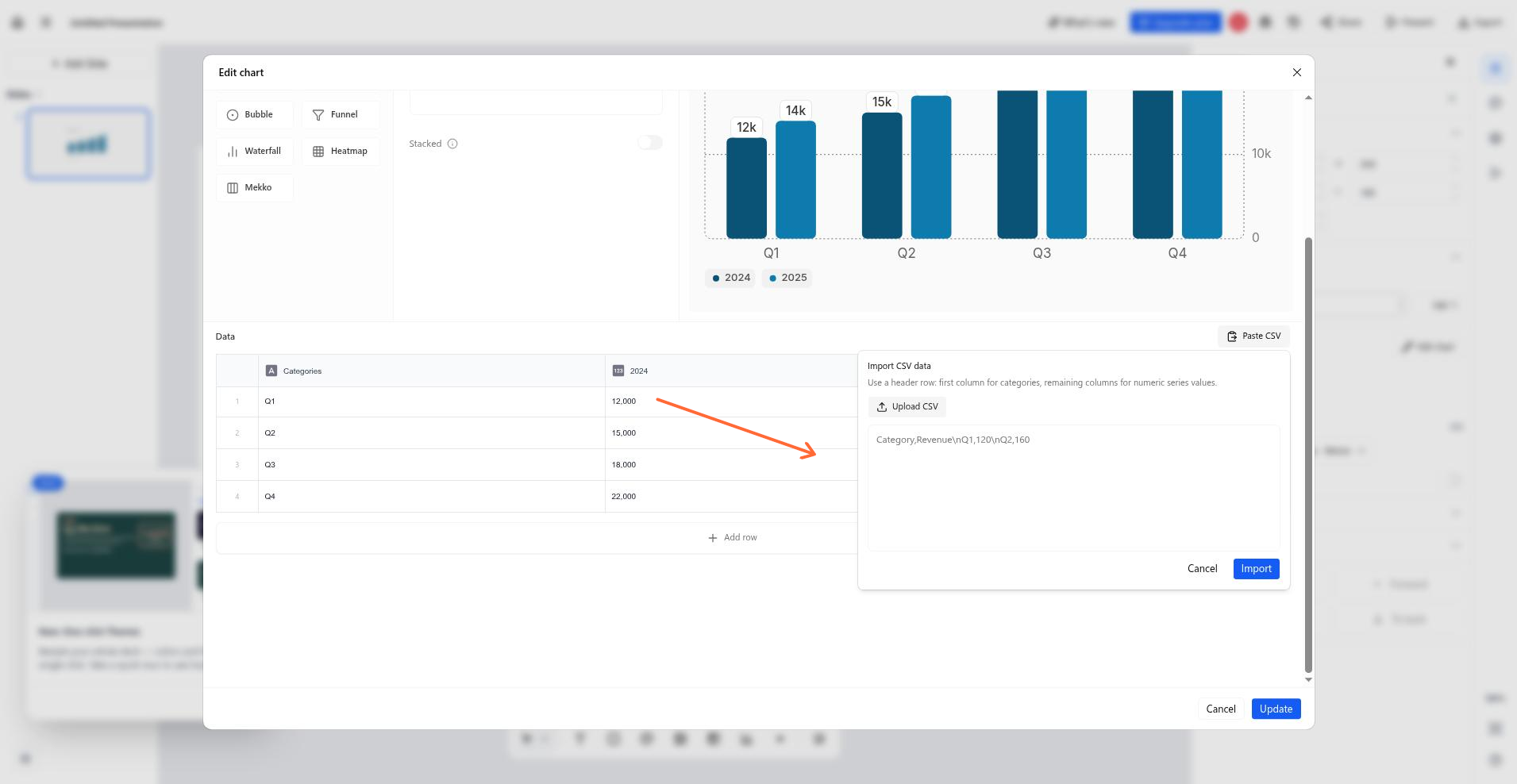
Accepted formats: currency prefixes ($ € £ ¥ ₹, sign on either side — -$500 and $-500 both work), trailing % or currency symbols, accounting negatives like (500) becoming -500, thousands separators only in full digit groups, and scientific notation.
Quoted cells, byte-order marks, and CRLF line endings are handled.
European decimal notation such as 1,5 is rejected instead of being misread as 15.
Columns with no numbers at all (notes, owners) are skipped with a notice.
Mixed numeric and junk columns stop the import with an error pointing at the first bad cell.
Blank cells import as gaps (0).
Existing series names and colors are preserved by position.
Scatter and bubble columns
Scatter and bubble charts use positional column roles, shown as header suffixes. Scatter reads the first column as X and every further column as a Y series; bubble reads X, Y, Size. The roles are display-only — the series keeps the name you typed.
Annotate charts
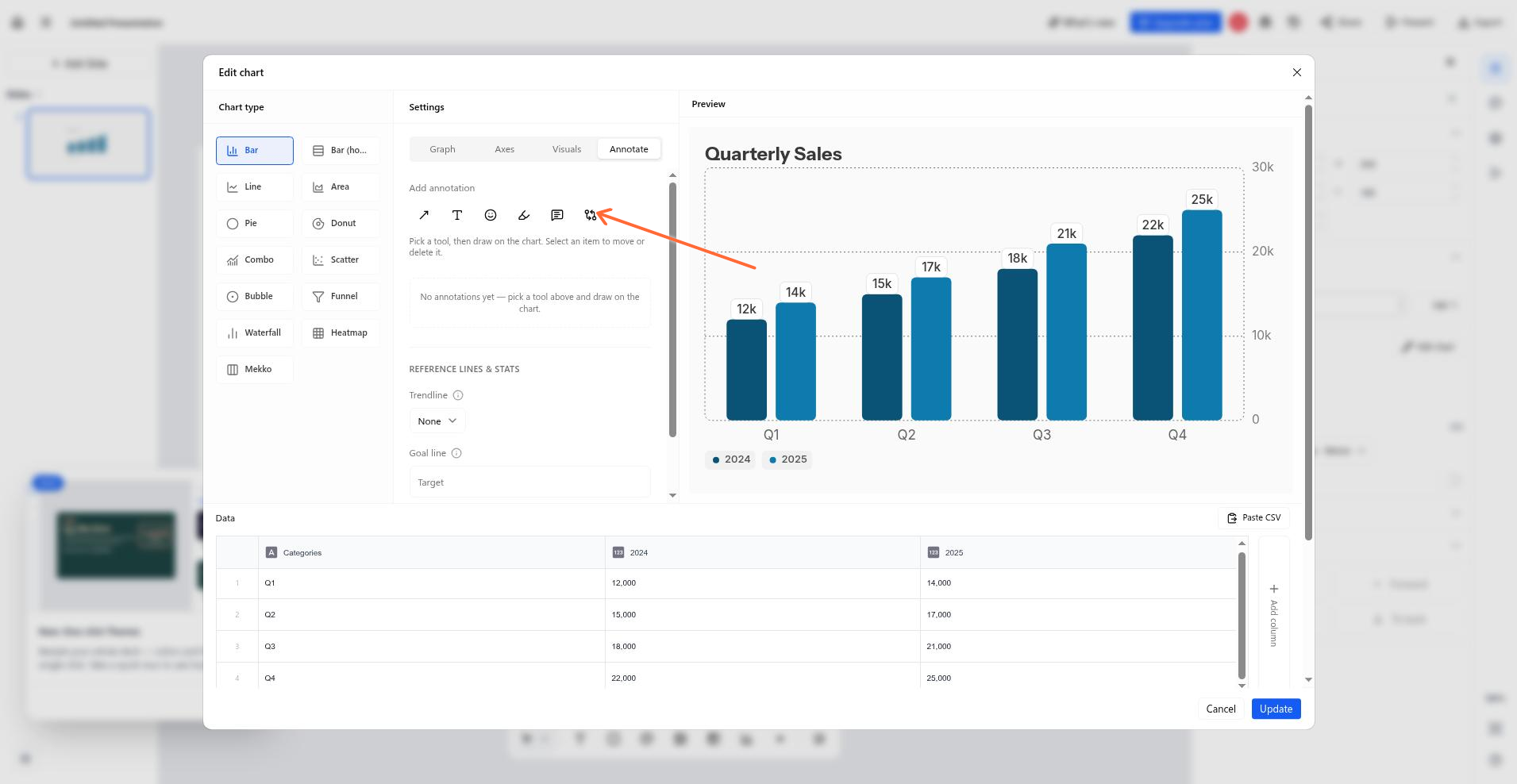
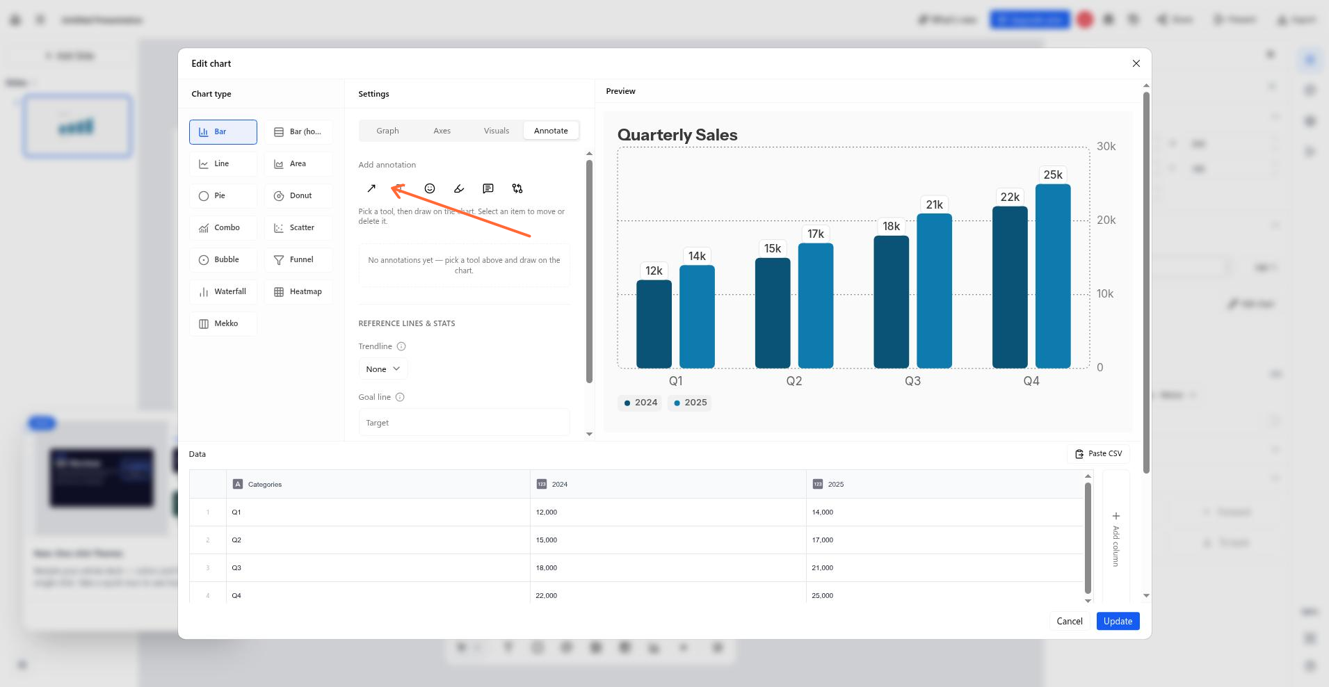
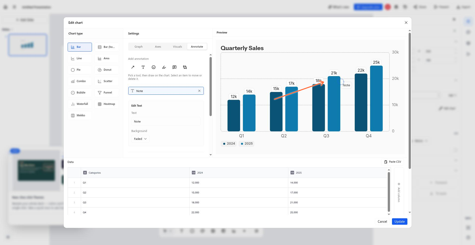
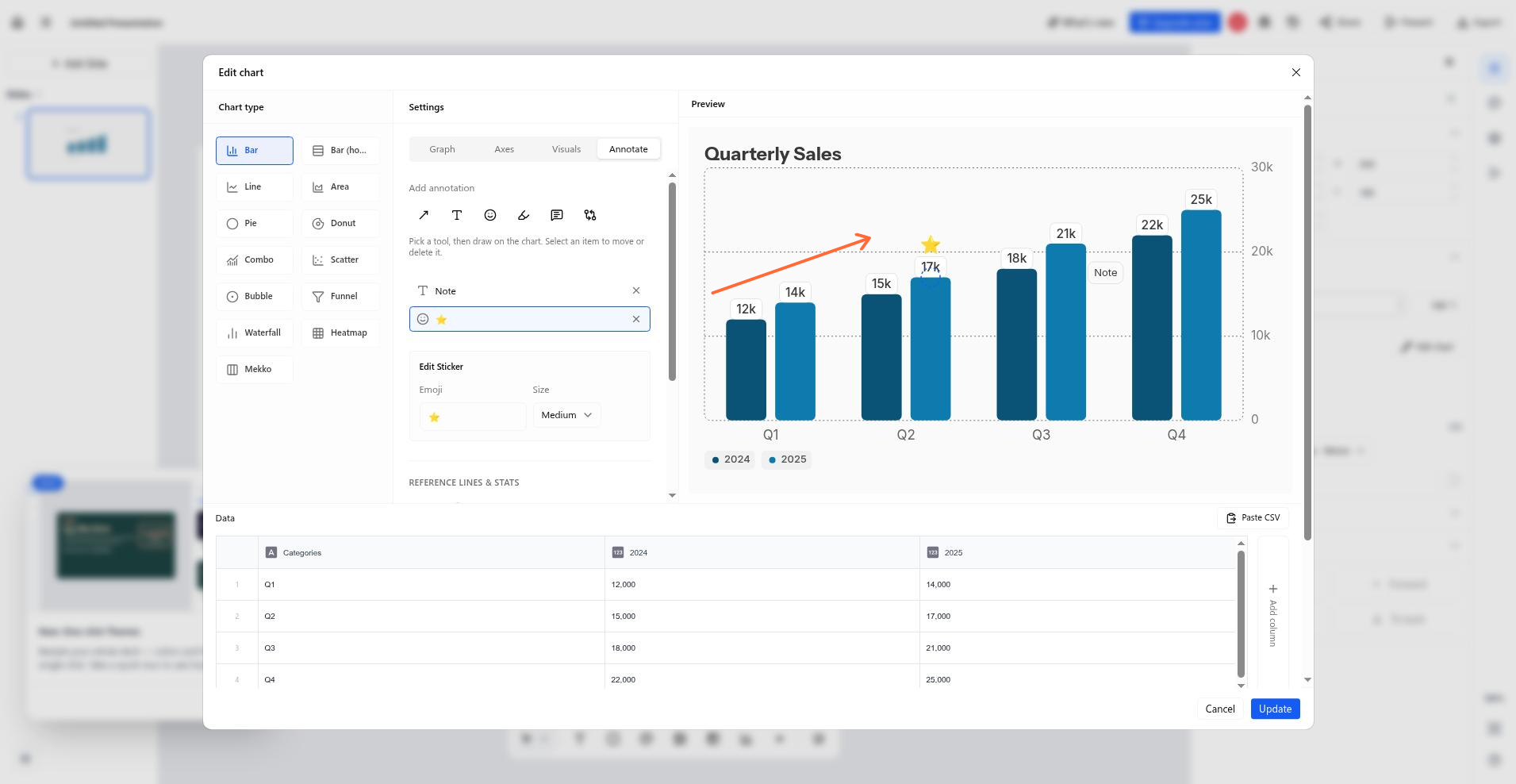
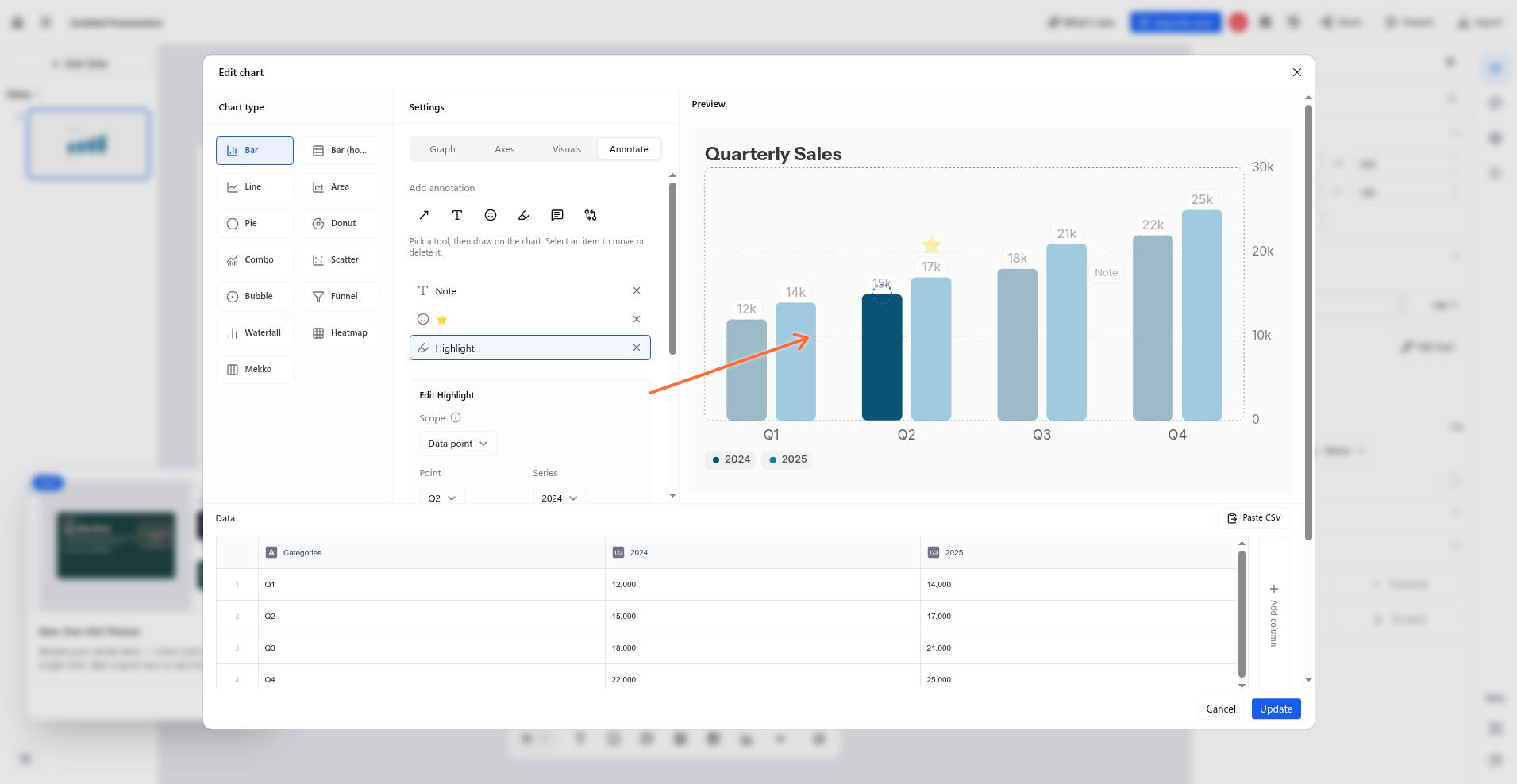
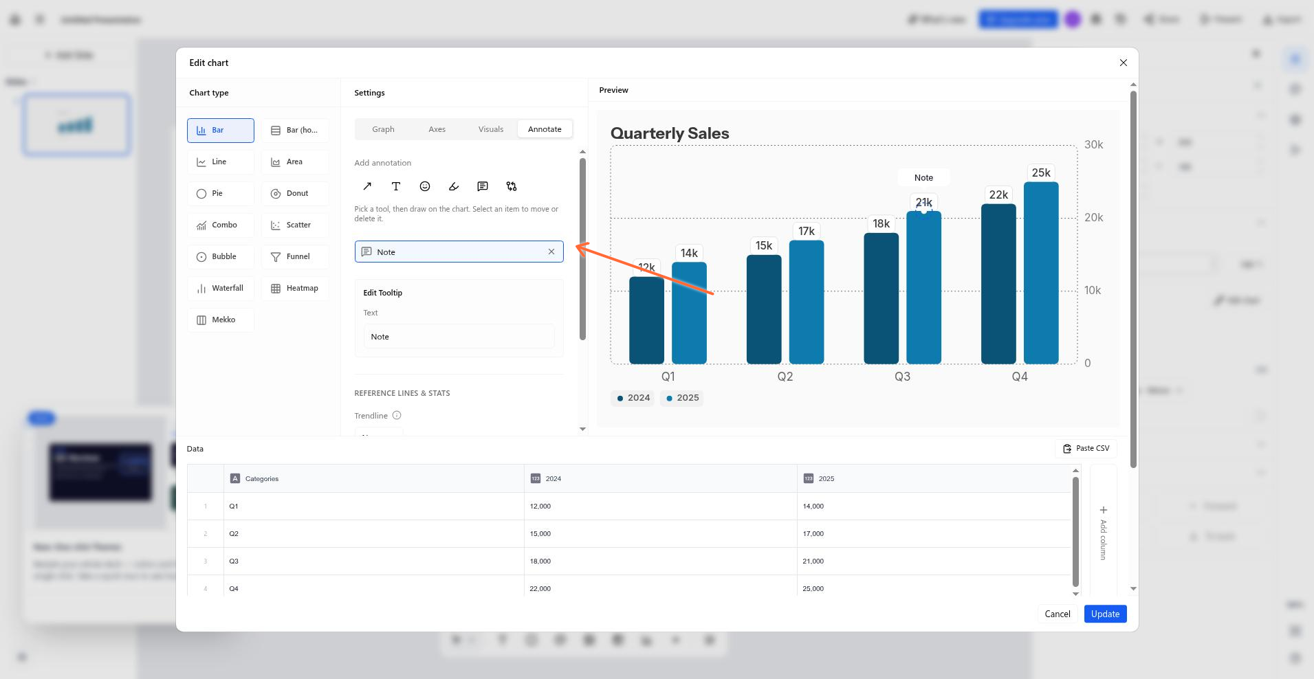
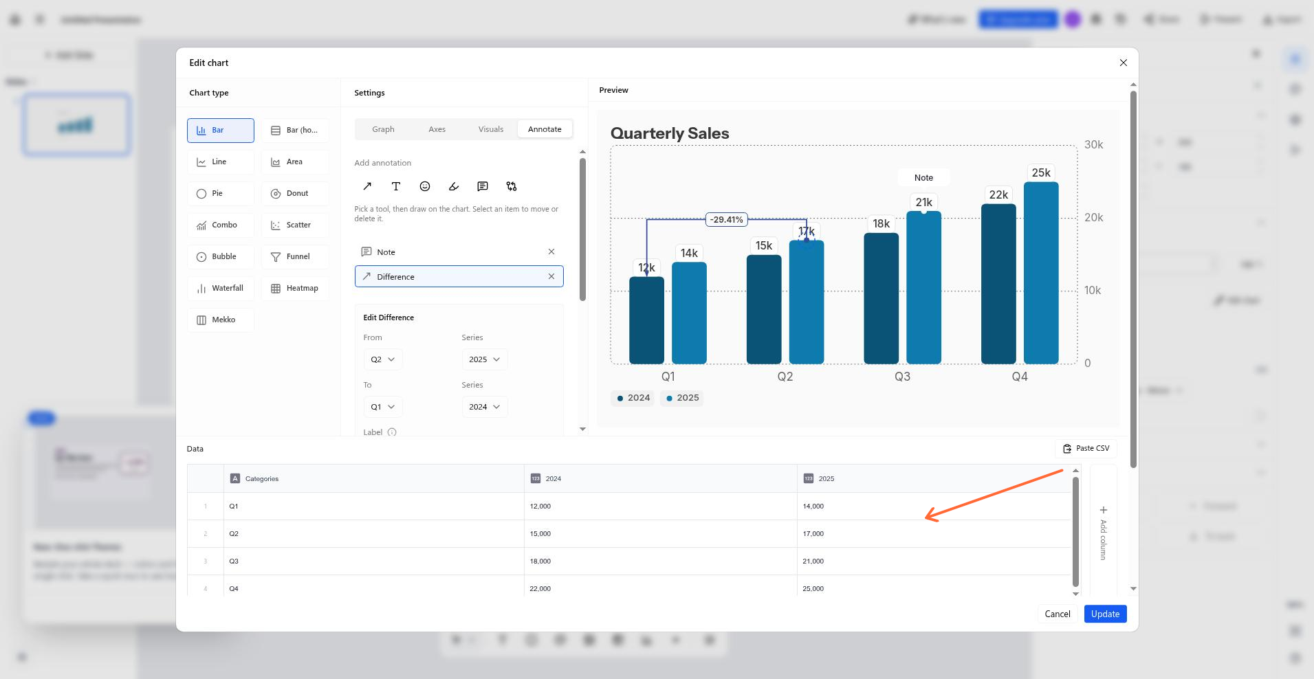
The Annotate tab holds six on-chart annotation tools. Two of them — Arrow and Text — work on every chart type; the other four are anchored to data points and are only available on bar (vertical), line, area (not 100% or stacked), combo with a bar series, funnel, waterfall, and mekko charts.
Tool | What it does | Where it's allowed |
|---|---|---|
Arrow | Drag on the chart to draw an arrow. Set thickness (thin, medium, thick), dashed style, start and end heads, and color. | All types |
Text | Click to place a note. Set width, color, and background (faded, solid, or none). | All types |
Sticker | Click a data point to drop an emoji. Set size (small, medium, large). | Anchored types |
Highlight | Click a data point to spotlight it, with scope of the data point, the whole series, or the whole category. | Anchored types |
Tooltip | Click a data point to pin a text callout to it. | Anchored types |
Difference | Click two data points to bridge them with a labelled arrow. Label mode: absolute change, percent change, or proportion. | Anchored types |
Annotations follow keep-data, hide-render: switching to a type that can't anchor them hides them with an in-panel notice but keeps them in the document, and switching back restores them. Any rendered annotation makes the chart export to PowerPoint as an image.
Fine-grained chart controls
The chart editor's settings panel has four tabs — Graph, Axes, Visuals, and Annotate — and hides any control the current chart type doesn't support, so the lists below are what you'll actually see.
Graph tab
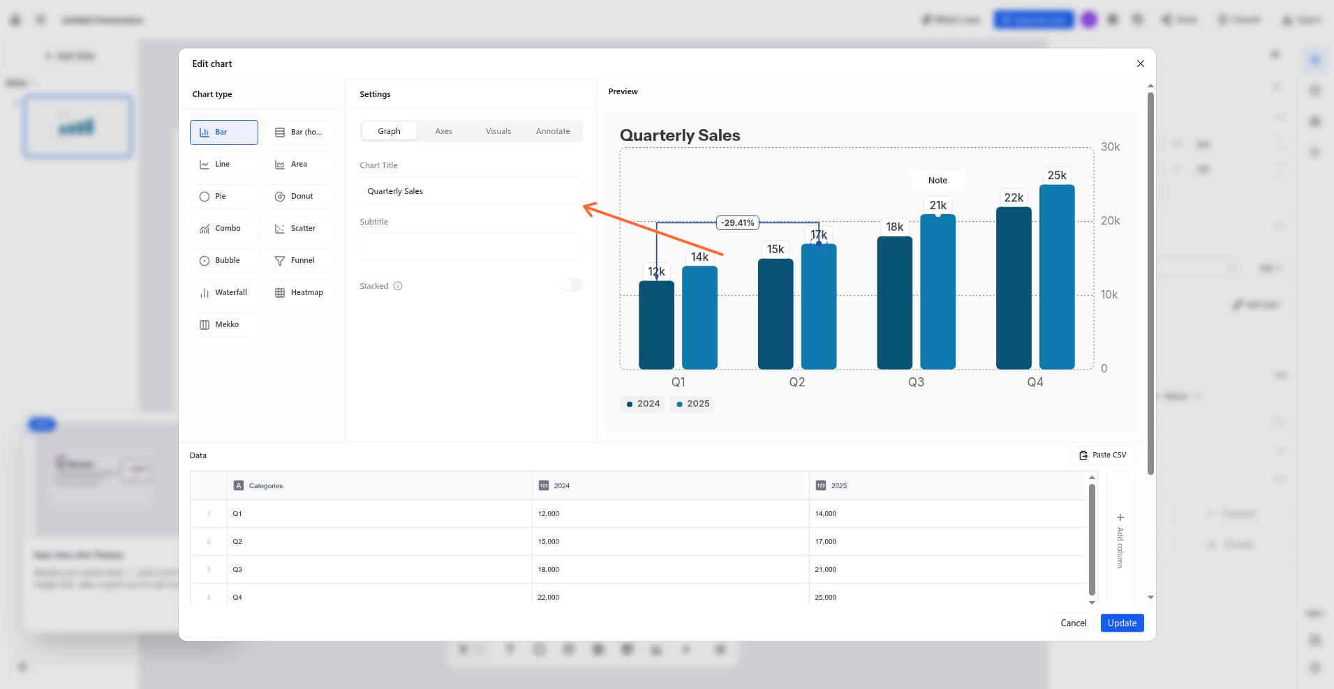
Chart title and subtitle — available on all types.
Stacked — bar and area charts with multiple series; 100% stacked is bar only.
Sort bars — horizontal bar, single series only.
Smooth line and Show points — line, area, and combo.
Source label — attribution text under the chart.
Axes tab
Axis controls exist only for axis-bearing types; pie, donut, and funnel have no Axes tab content.
X-axis and Y-axis titles.
Min/Max scale — the Y axis, with Auto as the default.
Show axis and Show grid lines.
Combo, waterfall, mekko, and heatmap draw their axis furniture unconditionally, so scale, grid, and Y-title controls are hidden for them. Horizontal bar has no Y-axis title control.
Visuals tab
Chart colors — a palette picker plus per-series color. This also applies through the sidebar Properties panel.
Legend — show or hide everywhere a legend exists (funnel and heatmap render none), and choose position (top, bottom, left, right, hidden) on bar, horizontal bar, line, area, scatter, bubble, pie, donut, and combo. Waterfall and mekko offer show/hide only.
Show data labels — funnel, heatmap, and mekko default them on, as the labels are integral to those displays.
Number format — standard or compact, a prefix (for example $), a suffix (for example %), and decimal places.
Reference lines — trendline, goal line (value plus optional label), and average line (pick a series; combo picks among its bar-role series). Available on vertical bar, line, area, combo with a bar series, scatter, bubble, waterfall, and funnel; not on horizontal bar, pie, donut, heatmap, or mekko.
Headline number — funnel only; overlays the overall conversion percentage.
Annotate tab
Alongside the annotation toolbar and per-annotation edit forms, the tab lists every annotation with per-item edit and delete.